Here are some final ideas for our magazine advert and for the outside of the digipak i like the use of colour and the artistic effects such as the scribbles. however i could reduce the amount put on the front maybe result to another sort of scribble like swirls or hearts . in addition the artist's name needs to be more visible . For the digipak i could change the font for the album title and also mention when the album is coming out ;like stating out 12th December instead of 12th December. in addition i could readjust the pictures so the artist's name is more visible .
Here is the second rough cut
From the previous rough cut i have
-made the editing more consistent for eg. if i have an overlay effect occurring, instead of cutting it off randomly in the video i have inserted a clip of the artist in-between so that it is not so sudden and more cross cutting is included to improve the editing .
-i have replicated certain effects so that it is not so random .
-i have experimented more with the wire-frames to make the edit to the beat more interesting
- i have experimented more with the colour grading to make the edit more interesting and to have the theme of constant surprises constantly flowing through
- i have gotten rid of the excess audio that is not part of the music instrumental changes that still need to be made
i need to change the scenes with the brick wall either make them more interesting to fit in with the rest of the video or totally strip it hopefully i can find a place in between as it varies the locations
using photo-shop i have experimented with different aspects of editing from different album cover / digipak templates to various experimental designs to do this i had to get to grips with working with the layers within photoshop
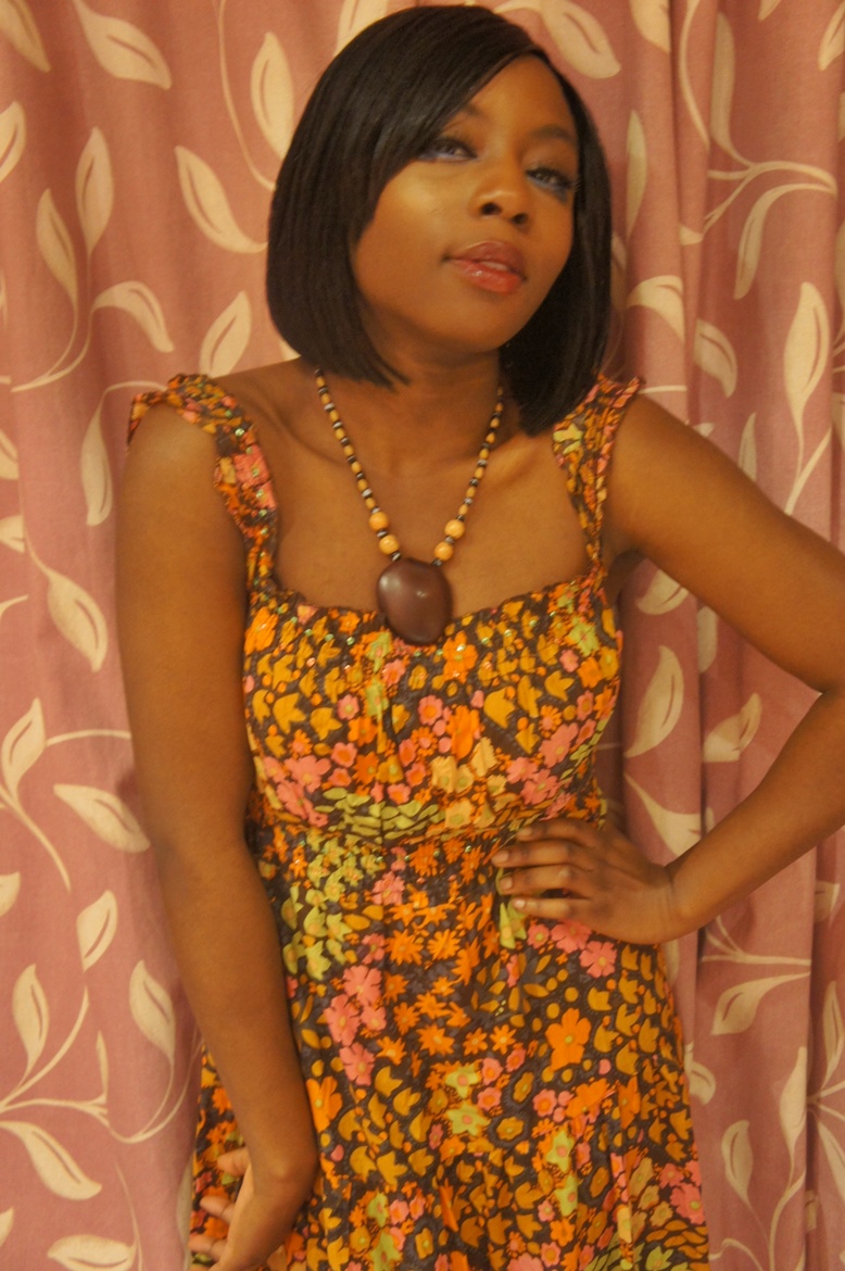
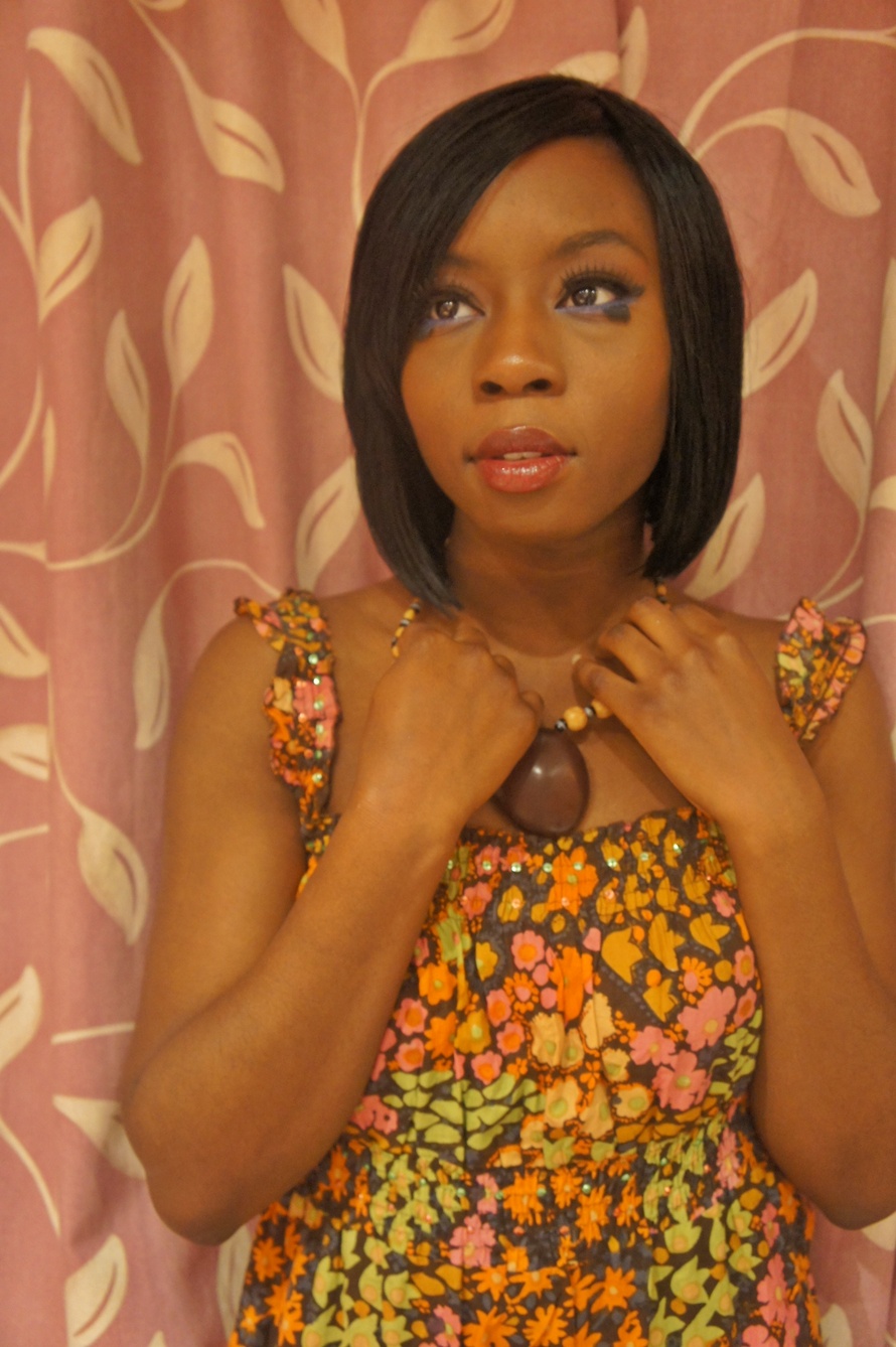
Here are some of the pictures taken for the digipak some have already been pre-edited there are a range of poses and shots some would be more suitable for the front of the digipak where as others may be more suitable for the different sections such as the back and inside covers
the make up is sixties inspired whereas the artist's outfit is styled more towards neo-soul centric with some added hippie influence .
Here is my rough cut for my music video there are certain things that need to be improved such as consistency with the edit and effects . furthermore i can experiment with the effects and framing of the screen so that it matches the beat .and the jump cuts
i should also remove the random effects at the end of the footage and replace it with something else so that it looks more professional in addition for my next cut i will try to improve the lip sync and when exporting the video i should make sure that the settings are correct so that i can get the best quality and the audio needs to be edited so that no sounds for the actual footage can be heard
Azealia banks 1991 video is a retro themed music video the genre of the song is hip-hop 1991 signifies the year of her birth
the music video opens up with a shot of a camera lens, this creates the sense that she is being watched by someone ( a voyeur) and azealia continues to play to the camera and engage with it through out the music video. As the instrumental continues there are various shots of her body parts as the camera pans across playing with the male gaze and show casing the artist .
the fishnet tights are more alluring and provocative as she showcases her legs to the camera the editing remains consistent as the short instrumental plays
however as the song begins with the lyrics the editing begins to speed up and becomes more rapid showing various locations of the artist to the beat . 0:026 the artist fits the conventions of a hip hop / rap video as she is show casing beats by Dre headphones marketing them to viewers as the video continues Azealia continues to engage with the camera she is aware that she is being watched and continues to play with the camera . as the video continues there seems to be no clear narrative or of visuals that amplify the lyrics as the song continues the editing begins to pick up with a range of rapid shots that match the beat of the song . the editing of the video is very effective as it keeps the viewers engaged and helps with the progression of the song it, additionally adds a playfulness to the video as azealia is not a serious character and likes to be playful in a range of her videos . we could add a playfulness to the editing to our music video as like azealia's 1991 the song constant surprises has a strong beat that you can edit to
as the song is 1991 the theme of the video matches the retro theme going back to the old fashion conventions that you would see in a less current hip hop video
the outfit that she is wearing is revealing and showcases her body playing to the voyeurism of the video we as viewers get the feeling that she is enjoying being watched as she is constantly engaged with the camera they are selling and promoting her as an artist .
the video showcases intertextuality the video 1991 uses dancers that move and are clothed like Madonna's dancers in the vogue video. likewise azealia banks is dressed like Madonna in the vogue video
"Pre-Madonna Mama, like a virgin" she has made reference to Madonna in her lyrics this could suggest the influence on the video however azealia takes a new spin on the out fit modernizing it and making it more revealing the dance routine in 1991 is additionally similar to the dance routine in Madonna's Vogue however she makes it more current giving it a hip hop spin . she uses some more shots similar to madonnna's vogue video . she showcases confidence throughout the video as from the lyrics she describes herself as a confident character and conveys this across through out the video
"Young tender from the NYC
No contender none in my league" she is the center of attention throughout the video
there is more intertextuality with more reference to Madonna's iconic vogue video with the similar shot using a mirror to create a reflection
We have decided that some of our shots for our music video will be shot inside a room with a white background wall and or canvas we thought this would be simple but effective so we could have a variety of locations or scenery as some of our video will be shot outside
a shot from our music video inside
below are some inspirational shots that were filmed inside or by a wall
in Lana Del Reys video games this shot is in colour by a white wall
Lana Del rey video games
beyonce if i were a boy
rihanna California king bed
in Beyonce's if i were a boy this shot works well against a white wall as the colour is black and white though it is simplistic it is effective whilst editing our music video we could experiment with the colour grading in the scene when we film indoors
in rihanna's california king bed though the wall may not be white it is still an effective shot
i did some research on a music video director Michel Gondry
-Gondry was born in Versailles, France.
"His career as a filmmaker began with creating music videos for the French rock band Oui Oui, in which he also served as a drummer. The style of his videos for Oui Oui caught the attention of music artist Björk, who asked him to direct the video for her song "Human Behaviour". The collaboration proved long-lasting, with Gondry directing a total of eight music videos for Björk. Other artists who have collaborated with Gondry on more than one occasion include Daft Punk, The White Stripes, The Chemical Brothers, The Vines, Steriogram, Radiohead, and Beck. Gondry has also created numerous television commercials. He pioneered the "bullet time" technique later adapted in The Matrix, (he met Joel Silver, the producer of the movie and he had no choice but accept the deal for a small amount) in a 1998 commercial for Smirnoffvodka, as well as directing a trio of inventive holiday-themed advertisements for clothing retailer Gap, Incorporated."
i took some screen shots of some cool effects used in Michel gondry music videos
When deciding to shoot scenes for our music video we have to consider the weather as we have decided to have some scenes out doors. We have desired for the weather to be prestige whilst filming as bad cloudy weather may affect the lighting or affect scenes when we decide to shoot for our music video. to make sure we avoid the cloudy or rainy days we have decided to keep up with the weather forecasts and make sure that the weather will be suitable for filming . we have used various weather forecast sites to keep up with the weather in hopes that we will have a sunny day even if the temperatures are not high .
For our digi-pak i have been doing some research into various artists' album covers;to get inspiration for our own album cover and digipak. Below are some of the album covers that stood out to me and i think some of the styles ,layouts and fonts of the album covers would suit the music genre of our album i think that we
could include some of the themes and designs within our own digipak .
Amy Winehouse's back to back album cover is very simplistic ,however the font on the album cover stood out to me. Her name(the name of the artist ) is in bold large font which stands out and goes across the picture. The style of the font suits the album and represents the artist Amy Winehouse who was a bold artist . for our album cover this type of font could suit our album cover and we additionally be effective . in addition i like the colour grading used which gives the album cover a golden look. however there is no use of bright colours which i think works for this album . if we were to experiment with colour grading this would be a good example to follow
Duffy's album cover for Rockferry stood out to me though it is very simplistic i liked the colour grading used. her style of her music and voice is very retro this could be the reason why they have chosen to use the black and white colour grading as it represents a dated look if we were to use black and white colour grading for our album cover /digipak this would be a prime example , in the planning processes we have considered using black and white colour grading as we feel it would suit the album . Her name on the album cover is like a signature font and gives it an added elegance to the cover whilst the name of the album is in white bold large font unlike Amy's Back to black her name appears smaller than the name of the album but if we were to use this style of font we would probably make the name of the artist larger .
The little dragon album cover, sunshine stood out to me because of the bright bold colour's ,which gives the album a playful and fun feel to it . I like the scenery in the back drop as it adds to the quirkiness of the group .Even though i like the bright and bold colours used , we would not use them for our album cover, as in the planning process we decided that we would go for a simplistic feel to our album cover as we feel it would suit our artist more . However what we could consider using is the type of font that they have used on their cover ;as i like the design of the font ,the name of the group is bold and does not go across the artist's like in Duffy's and Winehouses cover but still manages to stand put against the busy and colorful backdrop however we would make the name of the album stand out more as it is not bold enough to stand out against the background.
The font of the little mix's album cover stood out to me as i like the positioning of the name of the album and the band name . in addition the name of the group is big bold and colorful and it stands out against the colours around. the colour grading is a mixture of black and white ;this could be a good idea for our album cover if we were to go with the black and white colour grading .however though the big font is effective for this album cover for ours i do not think that it would be suitable as it would consume the space on the cover . Though the colour grading is mostly black and white hints/splash of colour show through we could experiment with this effect on our album cover as i think it adds a playful and youthful feel to the album without going over board .
Rihanna's disturbia remixes album is very simplistic her face acts as a back drop for the album as it is central to the cover .if we were to use a close up shot of the artist ,this would be a good example to follow. In the preparation process we discussed using a range of shots for our Digipaks and a closeup shot of the artist was one that we could consider using . The font of the title is very simplistic i think the size of the font is just right for the cover but for our digipak cover we may consider making the font of the name of the album larger . however i do like the size of the artists name displayed . we could consider using a range of different colours i do like the font though it is very simple .They have not experimented with effects for the album cover they have used the real colours from the actual picture. however we have discussed using colour grading for our Digipaks.
i have already started drawing up some ideas for our digipak we have decided that the name of our album could be songs in motion the album cover will not reflect the meaning of the title like little dragon's sunshine album .
We have released a music video teaser for our chosen song constant surprises though are music video teaser is longer than the average teaser we have extended the music video teaser to show our processes so far . music videos teasers are usually released to create a buzz around the song and have people anticipate watching the music video. At times the teaser may vary from the actual music video .below are some examples of short music video trailers/music video teasers which vary from 20-30 s long examples of music video teasers
i liked the effects used in the war on drugs below are some of the shots shown that stood out to me
i love how the visual is slightly blurred it fits in with the theme of the song
this was a good out door shot i liked how the sun highlighted the scene
i like the use of overlay in this shot they have used scribbles to overlay the visual
we could use the overlay processes whilst editing our video to create this cool effect i like how they have used someone to overlay another shot i could incorporate this into my music video
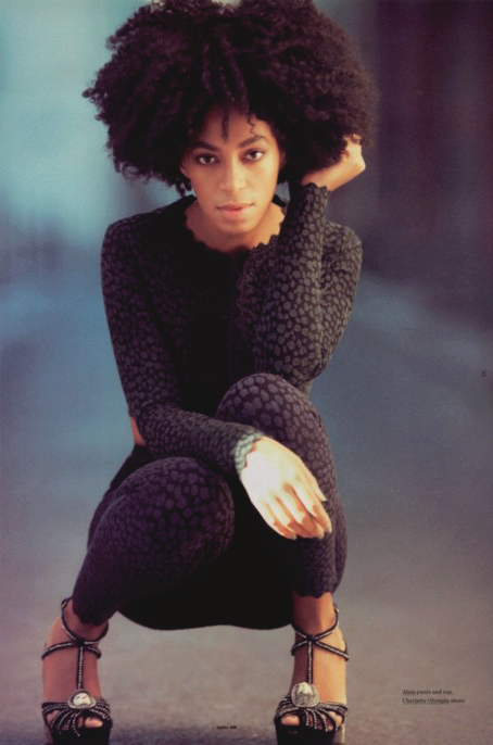
The prop used, the make up, the shot all elements we want to include in our album artwork
The focus on her face with her being in the middle of the frame really sells the artist which will be a good technique to use for our artist as she is still an establishing artist. The text is simple but stands out. Her make up is sixty's and hippie.
Solange Knowles, ethnicity/culture is betrayed through her style - the braids and the colourful headscarf.


 Here are some of the pictures taken for the digipak some have already been pre-edited there are a range of poses and shots some would be more suitable for the front of the digipak where as others may be more suitable for the different sections such as the back and inside covers


 the music video opens up with a shot of a camera lens, this creates the sense that she is being watched by someone ( a voyeur) and azealia continues to play to the camera and engage with it through out the music video. As the instrumental continues there are various shots of her body parts as the camera pans across playing with the male gaze and show casing the artist .
 the outfit that she is wearing is revealing and showcases her body playing to the voyeurism of the video we as viewers get the feeling that she is enjoying being watched as she is constantly engaged with the camera they are selling and promoting her as an artist .

 there is more intertextuality with more reference to Madonna's iconic vogue video with the similar shot using a mirror to create a reflection


 Amy Winehouse's back to back album cover is very simplistic ,however the font on the album cover stood out to me. Her name(the name of the artist ) is in bold large font which stands out and goes across the picture. The style of the font suits the album and represents the artist Amy Winehouse who was a bold artist . for our album cover this type of font could suit our album cover and we additionally be effective . in addition i like the colour grading used which gives the album cover a golden look. however there is no use of bright colours which i think works for this album . if we were to experiment with colour grading this would be a good example to follow
  Duffy's album cover for Rockferry stood out to me though it is very simplistic i liked the colour grading used. her style of her music and voice is very retro this could be the reason why they have chosen to use the black and white colour grading as it represents a dated look if we were to use black and white colour grading for our album cover /digipak this would be a prime example , in the planning processes we have considered using black and white colour grading as we feel it would suit the album . Her name on the album cover is like a signature font and gives it an added elegance to the cover whilst the name of the album is in white bold large font unlike Amy's Back to black her name appears smaller than the name of the album but if we were to use this style of font we would probably make the name of the artist larger .
 The little dragon album cover, sunshine stood out to me because of the bright bold colour's ,which gives the album a playful and fun feel to it . I like the scenery in the back drop as it adds to the quirkiness of the group .Even though i like the bright and bold colours used , we would not use them for our album cover, as in the planning process we decided that we would go for a simplistic feel to our album cover as we feel it would suit our artist more . However what we could consider using is the type of font that they have used on their cover ;as i like the design of the font ,the name of the group is bold and does not go across the artist's like in Duffy's and Winehouses cover but still manages to stand put against the busy and colorful backdrop however we would make the name of the album stand out more as it is not bold enough to stand out against the background.
 The font of the little mix's album cover stood out to me as i like the positioning of the name of the album and the band name . in addition the name of the group is big bold and colorful and it stands out against the colours around. the colour grading is a mixture of black and white ;this could be a good idea for our album cover if we were to go with the black and white colour grading .however though the big font is effective for this album cover for ours i do not think that it would be suitable as it would consume the space on the cover . Though the colour grading is mostly black and white hints/splash of colour show through we could experiment with this effect on our album cover as i think it adds a playful and youthful feel to the album without going over board .