Showing posts with label research. Show all posts
Showing posts with label research. Show all posts
Monday, 12 November 2012
locations and influences
We have decided that some of our shots for our music video will be shot inside a room with a white background wall and or canvas we thought this would be simple but effective so we could have a variety of locations or scenery as some of our video will be shot outside
below are some inspirational shots that were filmed inside or by a wall
in Lana Del Reys video games this shot is in colour by a white wall
in Beyonce's if i were a boy this shot works well against a white wall as the colour is black and white though it is simplistic it is effective whilst editing our music video we could experiment with the colour grading in the scene when we film indoors
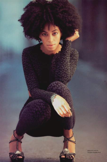
in rihanna's california king bed though the wall may not be white it is still an effective shot
 |
| a shot from our music video inside |
in Lana Del Reys video games this shot is in colour by a white wall
 |
| Lana Del rey video games |
 |
| beyonce if i were a boy |
 |
| rihanna California king bed |
in Beyonce's if i were a boy this shot works well against a white wall as the colour is black and white though it is simplistic it is effective whilst editing our music video we could experiment with the colour grading in the scene when we film indoors
in rihanna's california king bed though the wall may not be white it is still an effective shot
planning and research
When deciding to shoot scenes for our music video we have to consider the weather as we have decided to have some scenes out doors. We have desired for the weather to be prestige whilst filming as bad cloudy weather may affect the lighting or affect scenes when we decide to shoot for our music video. to make sure we avoid the cloudy or rainy days we have decided to keep up with the weather forecasts and make sure that the weather will be suitable for filming . we have used various weather forecast sites to keep up with the weather in hopes that we will have a sunny day even if the temperatures are not high .

different album cover and album fonts (inspirations)
For our digi-pak i have been doing some research into various artists' album covers;to get inspiration for our own album cover and digipak. Below are some of the album covers that stood out to me and i think some of the styles ,layouts and fonts of the album covers would suit the music genre of our album i think that we
could include some of the themes and designs within our own digipak .
 Amy Winehouse's back to back album cover is very simplistic ,however the font on the album cover stood out to me. Her name(the name of the artist ) is in bold large font which stands out and goes across the picture. The style of the font suits the album and represents the artist Amy Winehouse who was a bold artist . for our album cover this type of font could suit our album cover and we additionally be effective . in addition i like the colour grading used which gives the album cover a golden look. however there is no use of bright colours which i think works for this album . if we were to experiment with colour grading this would be a good example to follow
  Duffy's album cover for Rockferry stood out to me though it is very simplistic i liked the colour grading used. her style of her music and voice is very retro this could be the reason why they have chosen to use the black and white colour grading as it represents a dated look if we were to use black and white colour grading for our album cover /digipak this would be a prime example , in the planning processes we have considered using black and white colour grading as we feel it would suit the album . Her name on the album cover is like a signature font and gives it an added elegance to the cover whilst the name of the album is in white bold large font unlike Amy's Back to black her name appears smaller than the name of the album but if we were to use this style of font we would probably make the name of the artist larger .
 The little dragon album cover, sunshine stood out to me because of the bright bold colour's ,which gives the album a playful and fun feel to it . I like the scenery in the back drop as it adds to the quirkiness of the group .Even though i like the bright and bold colours used , we would not use them for our album cover, as in the planning process we decided that we would go for a simplistic feel to our album cover as we feel it would suit our artist more . However what we could consider using is the type of font that they have used on their cover ;as i like the design of the font ,the name of the group is bold and does not go across the artist's like in Duffy's and Winehouses cover but still manages to stand put against the busy and colorful backdrop however we would make the name of the album stand out more as it is not bold enough to stand out against the background.
 The font of the little mix's album cover stood out to me as i like the positioning of the name of the album and the band name . in addition the name of the group is big bold and colorful and it stands out against the colours around. the colour grading is a mixture of black and white ;this could be a good idea for our album cover if we were to go with the black and white colour grading .however though the big font is effective for this album cover for ours i do not think that it would be suitable as it would consume the space on the cover . Though the colour grading is mostly black and white hints/splash of colour show through we could experiment with this effect on our album cover as i think it adds a playful and youthful feel to the album without going over board .

Tuesday, 6 November 2012
inspirations for digi pak
The prop used, the make up, the shot all elements we want to include in our album artwork    |
Solange Knowles, ethnicity/culture is betrayed through her style - the braids and the colourful headscarf.
digi paks analysis

The font is basic however the pink is additionally made to embody the barbie image with the font being made to look similar to barbie
the parental advisory shows that this album may contain explicit lyrics .


the photo on the CD is made to look like barbie Nicki Minaj is up-holding her "image" her make-up and hair is exactly the same as barbie . we as consumers do not take her seriously because of her expressions on the album we can
tell that it is playful


the cover is focused on her with a close up shot of Lana Del Rey not only are they selling the album they are selling the artist here the rose piercing her lips ties in with the title of her album "Born to die "
her make up is 60's based with thick ,black eyeliner and a hint of white liner and fake ,bold eyelashes it is dynamic but simple.
her name is bold and highlighted but the title of the album is faded this is Lana's first album so making her name the central focus could
draw more attention to the artist the colour of the rose is a vibrant and makes a good addition to the album

The album cover is focused on Beyonce they are selling her as an artist highlighting her body as her first solo album they have chosen to place the artist on the cover to introduce her to consumers even though this is not her first time releasing an album (destiny child ) the album genre is R&B her outfit fits the conventions of a female r&b artist showing off her body and she is "Glammed" up wearing a crystals/diamonds top .
the font shows beyonce's name in bold and the title of the album in a smaller less bolder font this could show that they are selling the artist as Beyonce is making her debut as a solo artist so people /consumers will be familiar with the artist .

The album cover is simple this is the Milk's debut album they are a band however they are not shown on the album cover they have decided to take a different take to it this makes the album more intriguing . the band's name is the milk they have placed a cat masked on a man as cat's drink milk this has a funny yet serious feel to it as the masked man is holding a gun however the album does not have a parental advisory tag on it this could suggest that the album does not have explicit content within it .
the name of the band is in black bold font they are introducing a new band and are selling them in the process
Wednesday, 24 October 2012
target market research

we did some research into little dragon's audience by looking at their followers on twitter. We found out that they have a mature audience , their ages range from 18 - 32 this age bracket would be the ages that our artist's music would appeal to we could try and market to a wider audience as our artist is slightly younger and may be able to appeal to a range of ages . we could try and target 15-30 year olds


Artist profile

This our artist Carmela M newman formerly known as Carmela Newman (born sept 6 1993) is a british trip hop synth pop recording artist and song writer .
Born in Canada and moved to the U.K at the age of eight at the age of 18 she pursued her singing career she scored a contract with Mute records an independent record label in the u.k after auditioning for the head of mute records Daniel Miler
She is making her debut on the 28 th of november 2012 her first album will be called Songs in Motion

Wednesday, 17 October 2012
target market research
Red Hot Chili Peppers
As the Little Dragon toured with Red Hot Chili Peppers, we figured they must have similar target audiences so here is our research on the Red Hot Chili Peppers.
The track, being of the rock style genre is very fast and upbeat. This makes it an attraction to the teenage audience. Their videos and the camera cuts were also fast to the beat of the song which again enhanced this lively teenage feel to the video.


The track, being of the rock style genre is very fast and upbeat. This makes it an attraction to the teenage audience. Their videos and the camera cuts were also fast to the beat of the song which again enhanced this lively teenage feel to the video.

In my opinion the Red Hot Chili Pepper’s target audience is people between the age of 13-21, going through many music changes, and many go through the rock phrase, but also I believe that they will have a audience of people over the age of 25, as they also would have grown up with the Red Hot Chilli Peppers. The reason I feel this band appeals, is because they are very unique to other American rock bands, and have a huge following from all over the world.


Friday, 12 October 2012
back ground history on the artist
Little Dragon - Road to success
The band have had considerable success in the US, being picked up by radio station KCRW in Los Angeles. Last year they performed a headlining tour of the States which included a performance on Late Night with Jimmy Fallon. In June, their most recent single Sunshine premiered on Jon Stewart’s The Daily Show.
The band is fresh off a tour where they supported The Red Hot Chili Peppers and played 15 festivals over the summer.
Although they haven’t gone looking for collaborations, Little Dragon have participated in a considerable number over the last few years. They’ve worked with Gorillaz and with Dave Sitek from TV on the Radio. Nagano has featured on tracks with SBTRKT, DJ Shadow and Raphael Saadiq. Recently the band recorded with Big Boi from Outkast and feature on his new album.
Their live performances take on a jazz-like approach, playing around with the structure of songs, so that no two performances are alike. “We don’t totally freak-out, but definitely as a band that uses a lot of electronic sounds, like to improvise. A lot of bands these days get lazy. The beauty of the vulnerability of being live can easily disappear, so the improv is important. Not maybe as much as going crazy on solos, but rather the philosophy of jazz music of playing together and reaching that high. There are no mistakes, so why not try something different,” Nagano says.
Tuesday, 9 October 2012
Friday, 5 October 2012
Tuesday, 2 October 2012
Tuesday, 25 September 2012
some cool techniques and editing used in music videos
 |
 |
| i like how the shadow is almost and extension of her body in the shot with the black and white effect used for the colour makes it very effective |
 |
| wonderful-angel |

 |
| little mix wings |
 |
| 1991 azealia banks |

 |
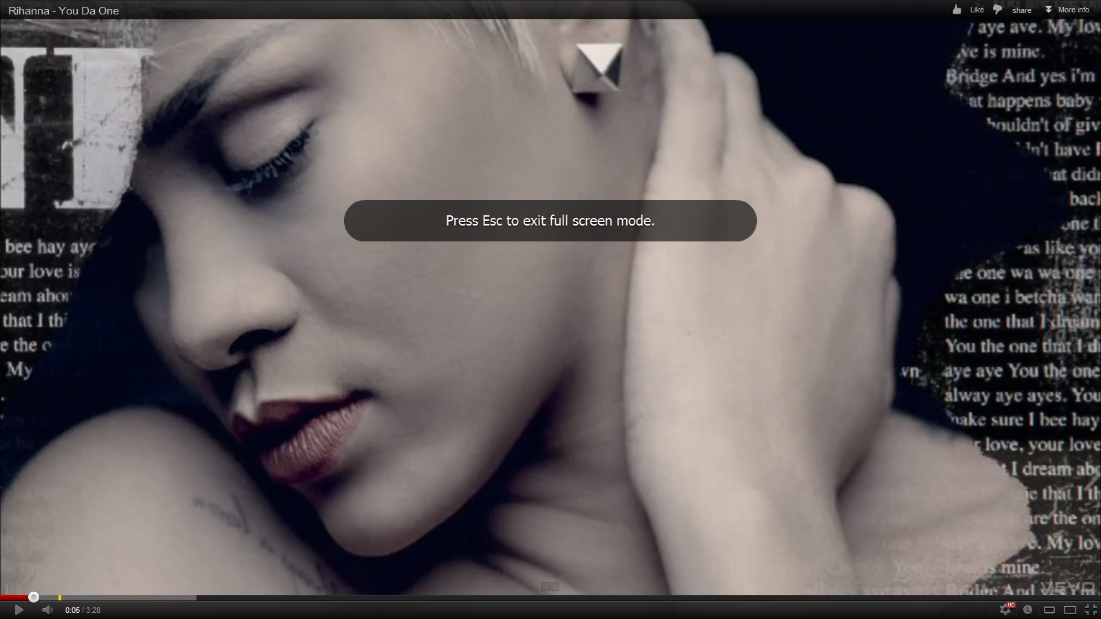
| rihanna your the one |
Friday, 21 September 2012
lyrics -Constant surprises
Lyrics to Constant Surprises :
I was walking home
Looking at the trees
Got the feeling that they
Were looking back at me
Thoughts that occurred to me
Where not of the usual kind
And I don't take it granted no
I don't call them mine
I don't call them mine
'Cause in my life things
Are built on
Constant surprises
Coming my way
Some call it coincidence
But I like to call it fate
Constant surprises
Coming my way
Some call it coincidence
But I like to call it fate
The higher forces want to connect
Last night in my dream I was talking to you
You know who you are
Were you dreaming too
'Cause in my life
Things are built on
Are built on
Constant surprises
Coming my way
Some call it coincidence
But I like to call it fate
Then on my way home I met this guy
He was not so shy
You know not that kind
We spoke then suddenly I could read his mind
You think it's mad
But I don't fool myself
You think its odd
'Cause in my life
In my life things are built on
They built on
They built on
Constant surprises
Coming my way
Some call it coincidence
But I like to call it fate
Constant surprises
Coming my way
Some call it coincidence
But I like to call it fate
Wednesday, 19 September 2012
possible song choices
we have decided to go with the band little dragon. Their genre is synth pop,trip hop , downtempo,soul
and we think that they are a great choice ,as they have a varied selection of songs which allow us to be creative and explore different ideas . the songs that we have selected is seconds,runabout and ritual union which all are varied quirky beats and different tone to them. in order to make a final selection we would have to consider the lyrics and what visuals we would use to reflect them.
little dragon are a Swedish electronic band the lead singer is yukimi nagono
studio albums :little dragon,machine dreams ,ritual union
 they have a verified twitter page they use it promote their songs and concerts
and we think that they are a great choice ,as they have a varied selection of songs which allow us to be creative and explore different ideas . the songs that we have selected is seconds,runabout and ritual union which all are varied quirky beats and different tone to them. in order to make a final selection we would have to consider the lyrics and what visuals we would use to reflect them.
 |
| little dragon |
little dragon are a Swedish electronic band the lead singer is yukimi nagono
studio albums :little dragon,machine dreams ,ritual union
Singles
- "Test/4ever" (7" vinyl) – 2006
- "Twice/Test" (7" vinyl) – 2007
- "Constant Surprises" (7" vinyl) – 2008
- "Recommendation" (iTunes) – 2008
- "Infinite Love" (track produced exclusively for a Cartier ad campaign) – 2008
- "Fortune"/"Blinking Pigs" – 2009
- "Feather"/"Stranger" (iTunes) – 2009
- "NightLight" (iTunes) – 2011
- "Ritual Union" (7"/12" vinyl) – 2011
- "Little Man" (iTunes) – 2011
- "Sunshine" (iTunes) - 2012

Subscribe to:
Posts (Atom)